Three Map-Legend Habits That Lead Readers Astray
Map legend habits can distort what a map says. Learn to check symbol meanings, units, and context before drawing conclusions from a map key.
The common mistake with map legends is recognizing a symbol and deciding its meaning before checking the key. That shortcut can turn a marked boundary into a road, or a shaded area into a claim the map never makes. Map legend habits are small, but they shape what readers think they are seeing.
Why does a familiar symbol mislead?
A line, dot, or colored patch does not carry one universal meaning. A dashed line might mark a trail on one map, a proposed route on another, and a boundary on a third. Even familiar colors are local choices: blue can indicate water, a transit line, or a category in a land-use map.
Readers often bring a mental key from another map. That is convenient, like using a key from a different apartment building because both keys are brass. The resemblance is not the evidence.
Check the exact symbol in the current map’s legend, including its line style, color, and any accompanying label. If the symbol is absent from the key, treat its meaning as uncertain rather than borrowing the interpretation from a nearby map or app.
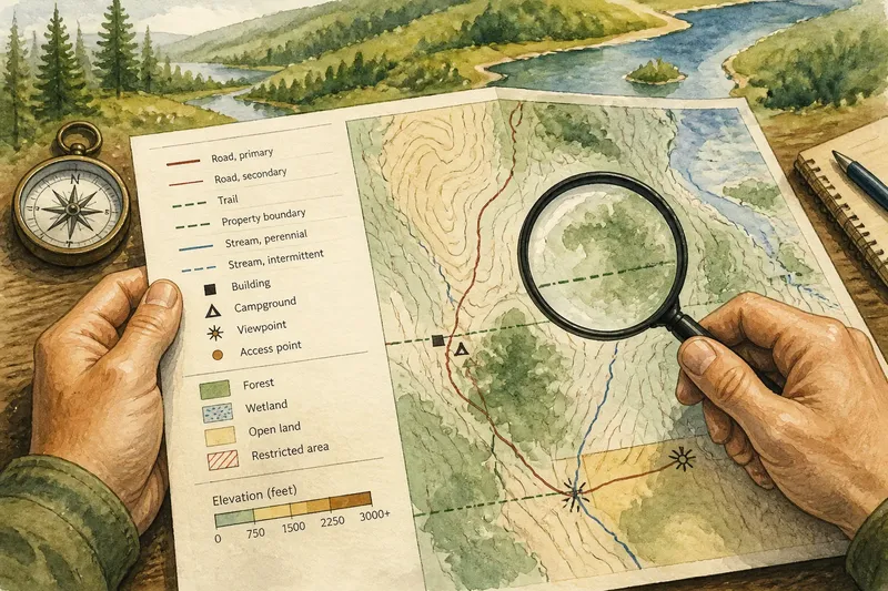
Imagine a park map showing a thin green dashed line across a wooded area. You might assume it is a hiking trail; the key, however, identifies that mark as a property boundary. Reading the legend first would keep you from treating a boundary as a route, and the visible line on the map would then make sense in its actual context.
Which details in the key deserve a second look?
Legends can distinguish categories with small visual changes. A solid line and a dashed line may refer to different road types; two similar shades can separate seasonal water from permanent water. Look closely at the sample marks rather than relying on the broad category name.
- Line patterns: Compare solid, broken, dotted, and double lines. The difference may distinguish a mapped feature from a limit or a route with restricted access.
- Point symbols: Check whether a marker identifies a building, a service, a viewpoint, or simply a location. Similar icons can carry different meanings.
- Color ranges: Read the labels beside a color ramp. A darker shade may indicate a higher value, but the key must tell you what value is being represented.
- Area fills: Note whether shading marks land cover, an administrative zone, a hazard area, or something else. The fill alone does not explain the category.
- Combined marks: A line over a colored area may represent a feature distinct from either symbol on its own. Check whether the legend includes that combination.
When symbols are crowded or printed faintly, compare the map mark with the legend at the same viewing size. Enlarging a digital map can clarify a pattern, but it can also make a thin dash look like a solid line. The key remains the reference point.
How can units change what a symbol says?
A legend may describe values in feet, meters, acres, hectares, or another unit. A color or line pattern without its unit is only half an instruction. The unit determines what the label means, and different maps may use different conventions for the same kind of feature.
Pay attention to words such as “depth,” “elevation,” “annual,” or “permitted.” They define what is being counted or described as much as the unit does. A map showing water depth is not saying the same thing as one showing elevation above a reference level, even if both use numbers and blue shading.
Also distinguish a mapped quantity from a symbol’s visual size. A larger circle might represent a larger value, or every circle might mark one location regardless of value. Look for a size key or explanatory note before comparing the marks.
What should you ask before interpreting a legend?
Does this symbol mean the same thing on every map?
No. Symbol meanings vary by map, publisher, and subject. Read the current legend rather than importing a convention from another map.
What if the symbol is missing from the key?
Do not assign it a meaning by resemblance alone. Check the map’s notes or source information, and keep the interpretation open if those do not explain it.
Why does the legend list a unit?
The unit tells you how to read the mapped value, while nearby wording tells you what the value measures. Both are needed before comparing colors, labels, or symbols.
Can the map title help explain an unfamiliar mark?
Yes, but only as context. A title can narrow the subject, while the legend defines the mark; neither should be made to do the other’s job.
How does context help without replacing the key?
Read the legend alongside the title, date or edition, and any notes printed around the map. These details can clarify the map’s subject and scope. A key for a transit diagram, for instance, may explain route lines and transfer points, while a street map uses similar marks for roads and boundaries.
Pay attention to the map’s edges, too. A symbol may apply only to a particular inset, layer, or region. If the map includes separate keys, match each one to the area it describes instead of assuming that the first key covers everything.
When a key uses a short label such as “access,” look for the map’s explanatory notes before deciding what access means. It could refer to public entry, a designated crossing, or another defined category. If the map does not clarify the term, do not turn a vague label into a firm conclusion.
What is a useful habit at the map itself?
Before drawing a route or making a claim from a symbol, pause and match the mark to the legend. Then check the unit and the label around it. This is especially useful when switching between a paper map, a phone map, and a printed information board: each may use familiar-looking symbols for different purposes.
For map legend habits that hold up across those formats, treat every key as specific to the map in front of you. A quick check of its symbols, units, and scope can prevent an easy visual assumption from becoming a wrong reading. The map may still leave a question unanswered; noticing that uncertainty is better than quietly filling it in.